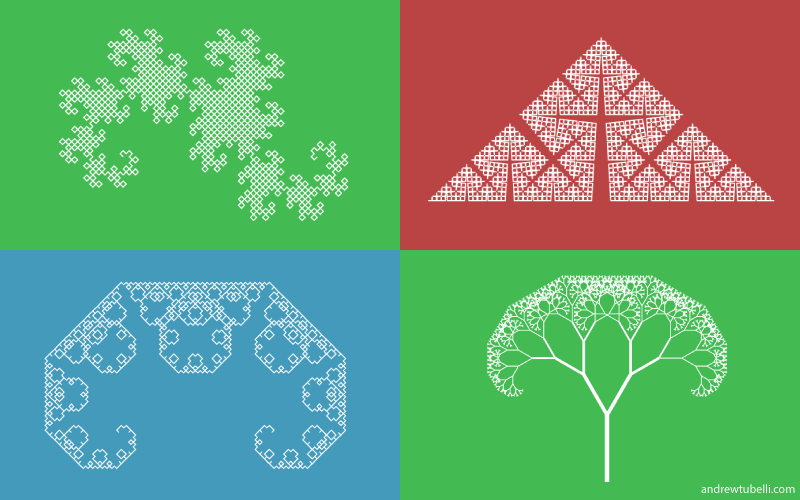
An experiment in creating fractals within the browser using JavaScript and D3.js. The fractals that are represented include: Koch curve, Koch snowflake, Cesàro fractal, Lévy dragon, Heighway dragon, Sierpinski gasket, Sierpinski carpet, binary tree, and Cantor set.
I am somewhat of an aviation geek. Since I was young, I enjoyed watching planes take off and land. To me, airplanes are an extraordinary accomplishment in engineering.
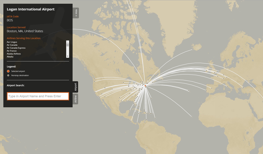
I decided it would be a fun data visualization challenge to depict the route maps for every commercial airport and airline. There are of course existing tools that already do this, including openflights.org and flightmapper.net, but I wanted to make one of my own.
The primary tools I used to build this interactive map were D3.js, Mapbox, Leaflet, JavaScript and jQuery. The map also features arc.js and typeahead.js.
Data came from many sources, wherever I could find the necessary information. That included Wikipedia, official airport websites, official airline websites, iata.org, and openflights.org. I intend to use this tool to show the most current route maps for every commercial airline; however, due to the constantly changing schedules of airports and the airlines that serve them, data is prone to be out-of-date or incomplete.
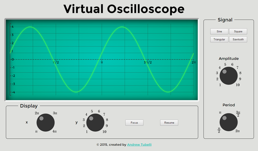
I felt like doing a more engineering-related visualization, so I made a simple oscilloscope visualization using D3.js and JavaScript. An oscilloscope is a device that shows an electrical signal as a function of time. This is a very basic visualization mimicking an oscilloscope that offers 4 types of waves: a sine wave, a square wave, a triangular wave, and a sawtooth wave. The x and y properties of both the signal and display properties can be changed.
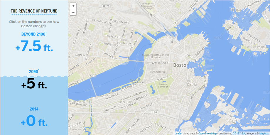
I had the opportunity to do some data visualization work for Boston University. There were a number of projects I worked on there, each with several team members, but here are three that have been published.
1. Lessons from Venice, Bostonia, Fall 2014
For this project, I developed an interactive map showing the predicted rise in sea level in the Boston area. I used Mapbox and Javascript.
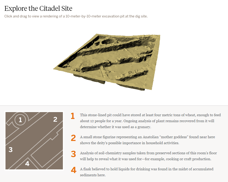
2. Picturing a Long-Gone Citadel, BU Today Special Report
My part in this project was getting a rotatable 3D model of a citadel excavation site in Turkey to show up in the browser. I used three.js, which uses WebGL and a canvas backup. If the browser supports neither of those, it defaults to a static image. I did not create the model or design the page.
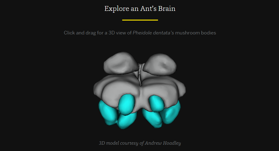
3. Five Thousand Heads are Better than One, BU Research
Similarly to the citadel, I used three.js to show a model of an ant brain. I did not create the model; I merely smoothed it and applied textures that matched the page design.